Destination
Church
BRANDING | WEB | GRAPHIC DESIGN | PRINT
")

")


")
“I want the presence of God himself, or I don’t want anything at all to do with religion…I want all that God has or I don’t want any.”
-A.W. Tozer
I am not a gifted theologian or an eloquent orator. I do, however, have some God given talents for design so I give of those.
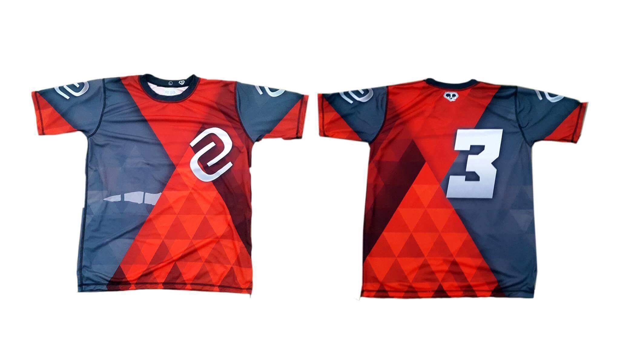
Over the past 5 years, I have completed numerous projects for DC… rebranding, logo designs, signage, apparel, full website overhaul, online streaming portal¹, podcasts³, sermon archives, DC Kids check-in kiosks², softball jerseys (I think you get the picture).
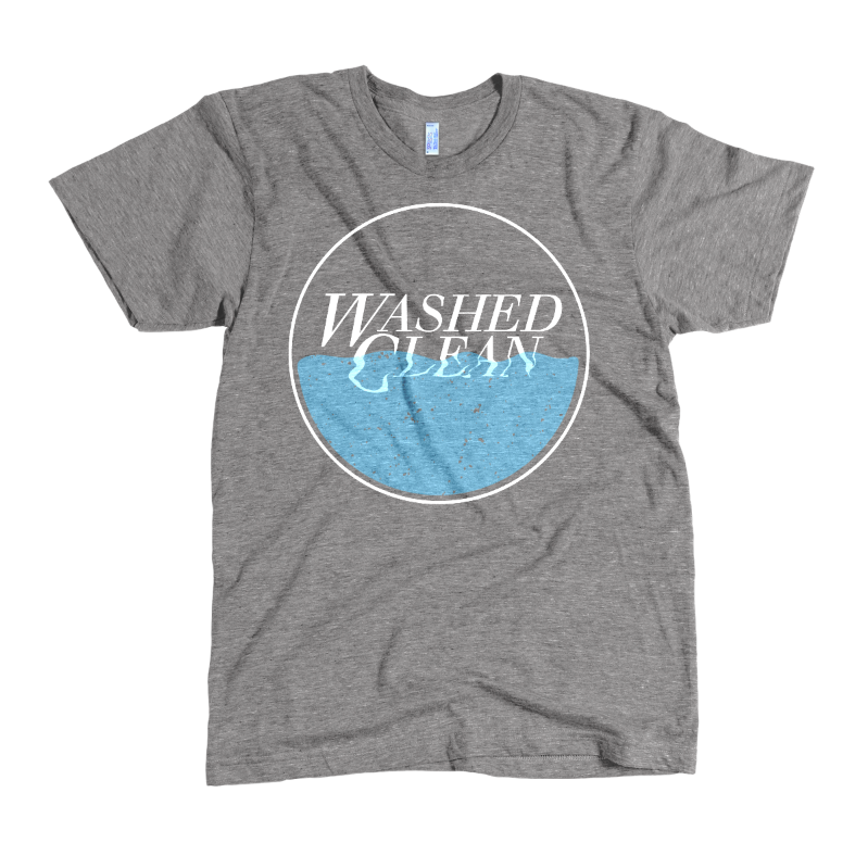
The images pictured above are designs for sermon series. I really enjoy these as it lets me break away from the business-centric design & have creative freedom.
1. Church Media Online
DC has used the Life Church online platform since its earliest days. We just recently completed a successful transition to v4 adding even more interaction between the viewers & our moderators. When the pandemic hit we were ready because we had long committed to a virtual service to rival our on-campus experience.
2. DC Kids Check-in
Using some kiosks repurposed from a large sporting goods retailer. We created self-service & manned stations for children’s check-in. Walk up, tap the screen, find your family & print your labels. Easy peasy.
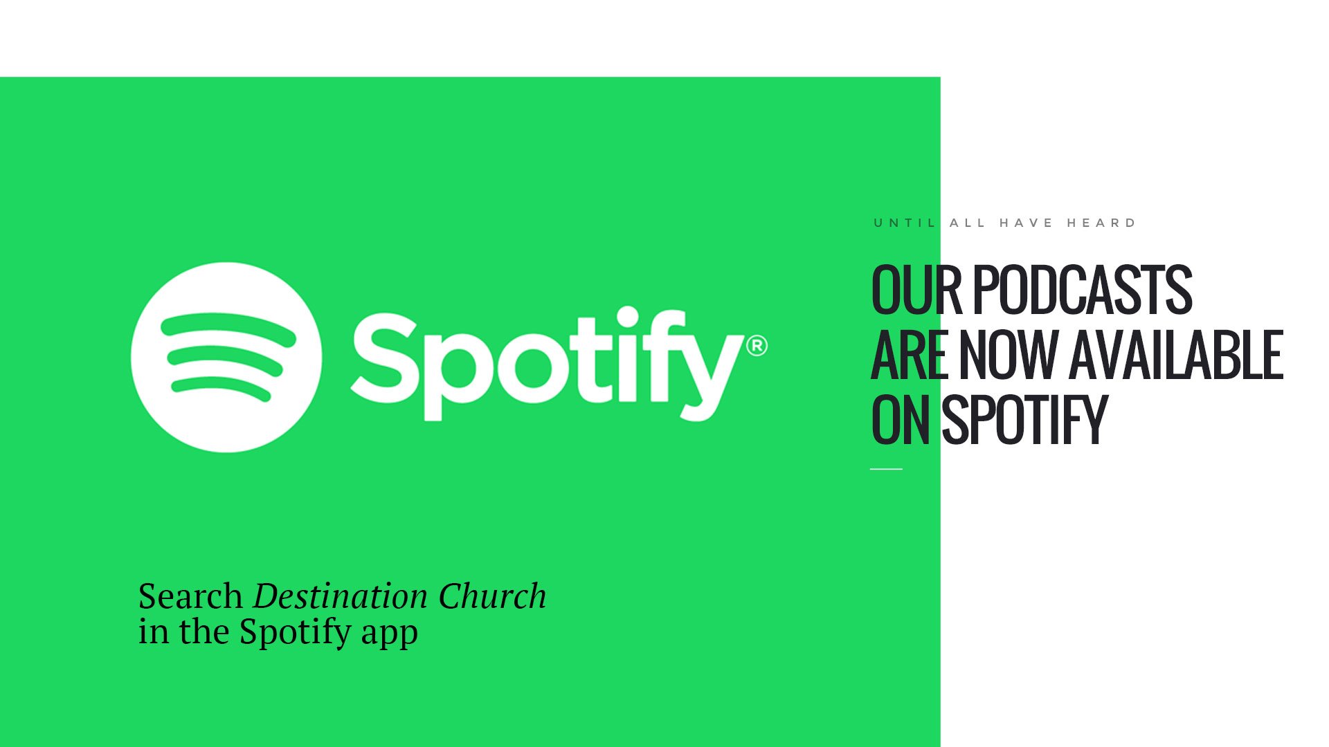
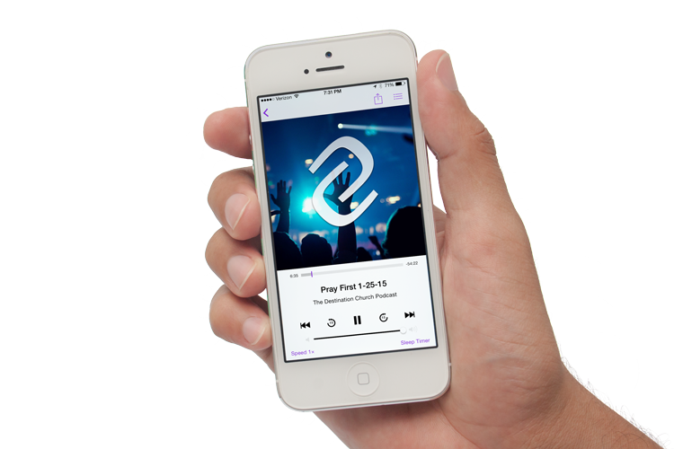
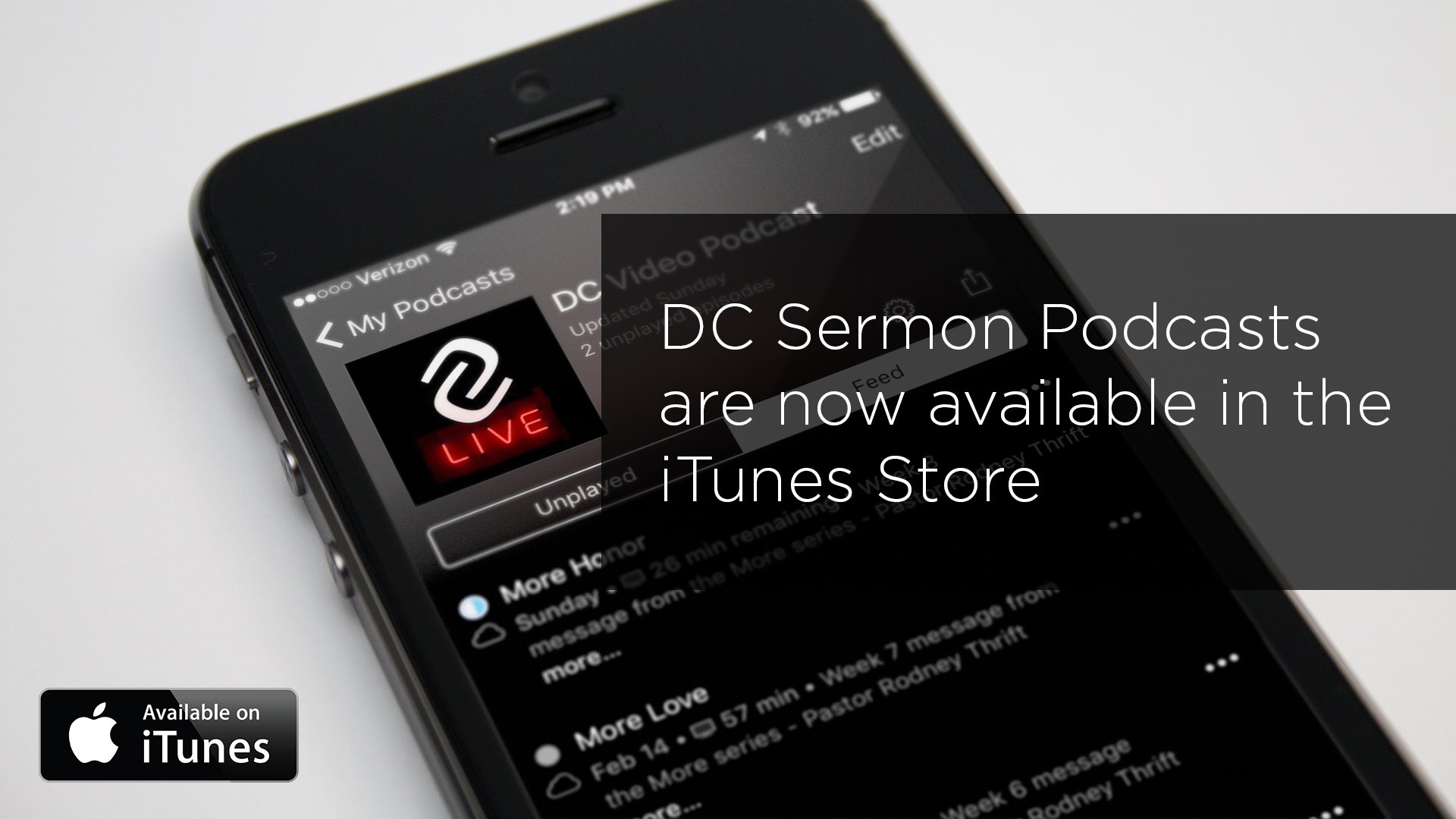
3. Sermon Archive/Podcasts
DC has a weekly syndicated audio & video podcast that you can listen to on your favorite podcast provider. There is also a full video archive of all our sermons available on the website.
Features
- Sermon Archive
- Podcasts (Audio & Video)
- DC Live (online streaming platform)
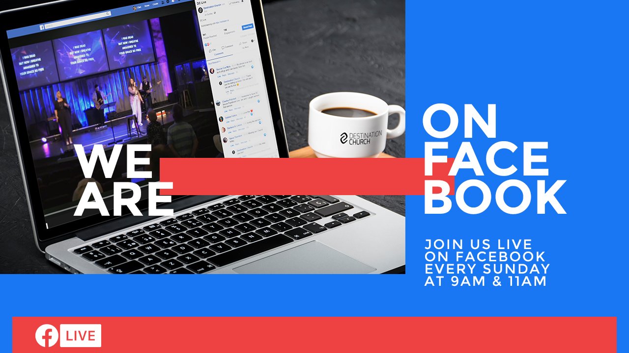
- Facebook Live Syndication
- Spotify Syndication
- Small Group Management
- Newsletter Signup
- Online Giving
Web Development
It was the desire of DC’s lead staff for their website to be the central hub for all things Destination Church.
Through a combination of detailed informational pages & 3rd party integrations, the website became the info destination (see what I did there) for visitors and church members.


Everyone counts.
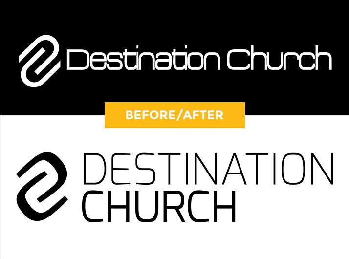
The “paper clips”
The interlocking DC icon has been there from the very beginning. This again is another instance of a good idea that can be refined into a great idea.
The “horseshoes”
The first thing I did was establish typography for the DC brand. The previous font was not part of a proper family & thus offered no weights. I settled upon the Exo font family. A very versatile font, with 9 weights (the maximum on the web) each with a true italic version. It works great as a display face but it also works good for small to intermediate size texts. Plus its each of use on the web since it belongs to the google webfont library.
I noticed the capital C had a nice “horseshoe” shape to it. I constructed the new icon out of that capital C & gave the icon some room to breathe. Then all that was left to do was create variations of the logo paying particular attention to the alignment of the logo elements (something that was lacking in the previous logo).
Follow the manual.
I created a 22 page brand manual as a visual guide for proper usage of the new branding. The manual is a reference for staff and members who need to understand the philosophy of, necessity for and process of brand management. The manual detailed variations of the logo, the brand typography family, safe space around the logo/logomark, & unacceptable uses of the logo.
live streaming
childrens ministries

the DC podcast
SWIPE FOR MORE →


SWIPE FOR MORE →
Architectural renderings…sure why not?
Couple of quick renders I made for our church renovation project. I was really surprised just how easy it is to get up and running with Sketchup.
With that being said, I taught myself the basics of this program & this is the one & only time I’ve used it.